Printer-Friendly Datafiles [Updated]
**UPDATE** If you mouse-over the Hero Datafiles page you will see a pop-out for a page with all the printer-friendly versions that are available. I won’t be posting updates every time I make one, just check there occasionally. I will try to get the backlog done in the next couple of weeks.
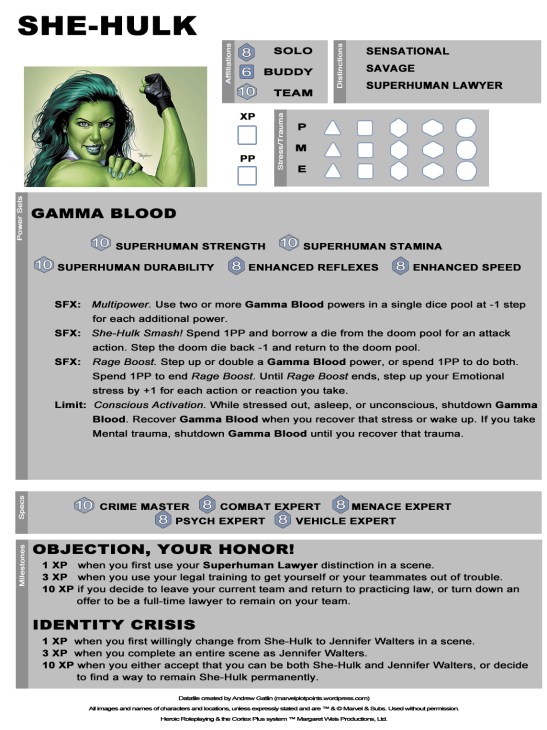
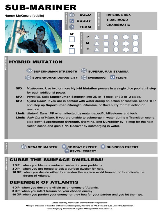
Several of you have asked for more printer-friendly versions of our datafiles. Here’s what I have come up with. Does it look like something you would want to see? The plan would be to offer both the normal version and the printer-friendly version.
Obviously these aren’t as pretty as our normal versions. I also can’t promise we would have time to do them with every datafile. We really need to know how much interest there would be in these. If there are only one or two of you who want them, it’s probably not something we want to invest our time in. So, let us know in the comments.


I like these a lot. Thought I could use them even with the white background as well.
It helps me to have the shaded blocks to keep the areas separate. We can lighten the backgrounds some more.
looks good to me
These are really nice to print. Even in black & white, it has a better look to them.
These are a great compromise between the full color files and the transformed ones I made the other day using the “Pencil Sketch” function on Picassa 3. If I had had these the other day, I would have printed them as is. Very nice and very legible! I hope these are generally available in the future, but I know all of this is a labor of love, so, I will take whatever you are putting out, and I always have my conversion trick to fall back on as necessary.
Thanks for all you do. Keep it up!
I’m much more likely to print these as player options for players in my home game and at cons. However, if its a lot of work, I’d settle for a grayscale version of the regular file, with the brightness adjusted. That’s pretty much what I’ve been doing when printing your files personally.
I think these definitely work better than the blue ones. I’m likely to transcribe them all onto my own custom datasheets (when I finally finish up the layout in InDesign), but for the time being, the gray-on-white will do.
I would use simple boxes (i.e., a thin stroke) instead of shaded backgrounds. That will be a easier on the printer and increase contrast, making the sheets easier to read.
Love them.
These look great. I have been saving your “blue datasheets” until such a time I could afford to print them. Even if you took a week away from regular updates to transfer the style, I would be all for it. You guys are most excellent; thanks for offering these free resources!
I second that!
looks good
Very nice! Please keep these coming!
I like the ones I can print much better; they are much more useful.
Thank you.
Huge fan of these. While I really like the full on prettied up versions, and I’d probably spring for printing them for conventions or the like, if I was just looking to print out sheets for a one shot or a spur of the moment game, these are so much more handy.
Excellent. I like them, and i would use them
I would definitely get more mileage out of a printer friendly data file. These look pretty good, though I agree with the above that the grey could be a little lighter.
Take a look at the Songbird file I posted today. I lightened up the grey a bit.
Agreed, these look good – maybe do a blank one?
Reblogged this on Alfonso Jermaine Turnage's Creative Writing Journal.